Ebay has redesigned its search experience to make it more intuitive and “visually rich.” Featuring larger, high-resolution images, streamlined navigation and a more modern layout, the new user experience (UX) was developed following 18 months of user research and testing.
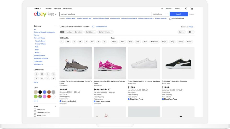
The main search page makes large product images the focal point. A new Shopping View replaces the previous gallery view, providing a full-width display without sidebar ads, so shoppers can easily browse highly visual categories such as clothing, shoes, accessories, jewelry, and toys. However, other elements, like larger and more streamlined menu buttons, can help shoppers find what products faster and easier. The top navigation panel and top-of-page filters also have been improved to include redesigned drop-down menus, so the experience is more intuitive.

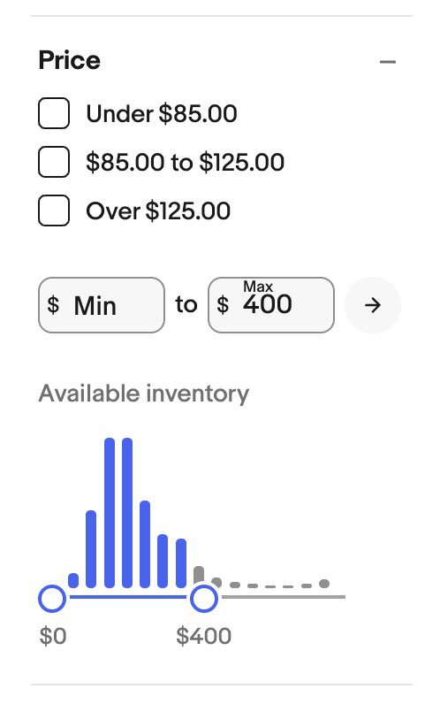
Products search results also can be narrowed using the price filter, which now includes an interactive graph, allowing users to adjust their price range and easily see price distribution within search results.
All product listing pages now have a uniform look and feel; they all have the same layouts, image sizes and fonts to create consistency. All delivery and shipping options also are now located in one convenient place, so shoppers can update their shipping locations and find their preferred delivery methods.
Ebay plans to make additional improvements to the ecommerce UX in the near future using AI and machine learning to create a more streamlined and personalized experience for both shoppers and sellers.
Advertisement
The new and improved search experience is Ebay’s latest investment in improving the platform’s overall UX and UI. This summer, the company unveiled a new hub to empower sellers with more detailed insights on advertising performance as well as a new Product Research tool that can help them gauge the average sold price of specific items.


